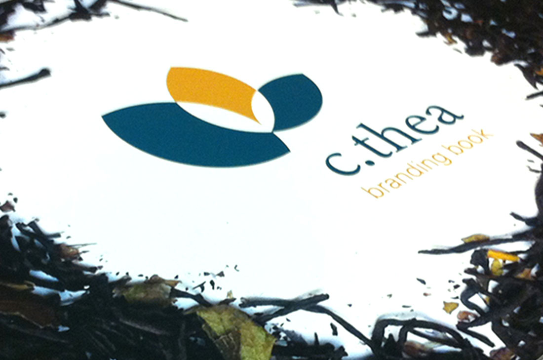
C. Thea was a group project, including myself, Ester Mezhlumyan, Olivia Notter, and Samantha Burns. The project consisted of defining...
These logos were all designed for separate projects. Emerald Resource Group was to use an “e” for Emerald and incorporate...
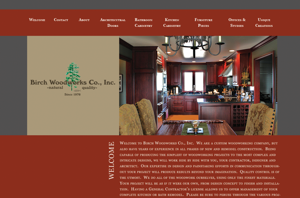
The client needed a website that portrayed the quality and professionalism of the company and their work. The website includes...
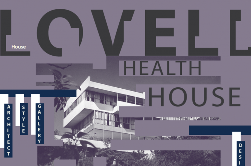
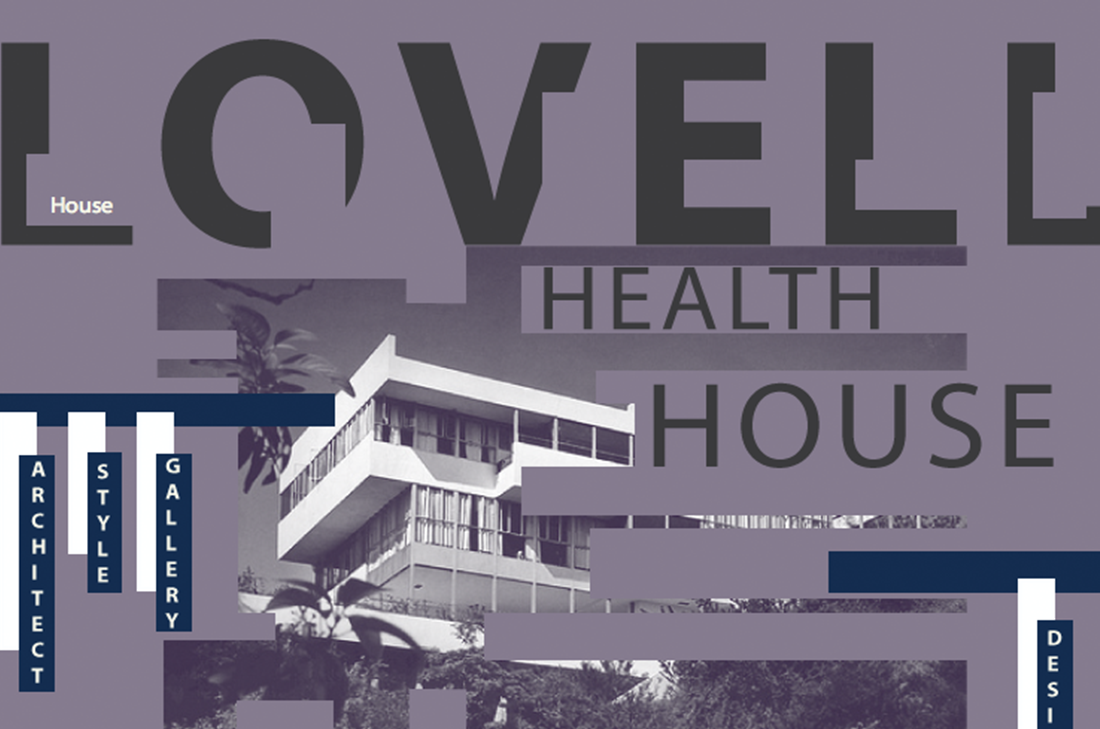
The website needed to have a home page that talked about the house in general, a page that talked about...
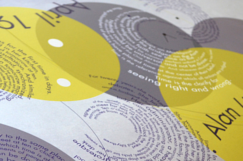
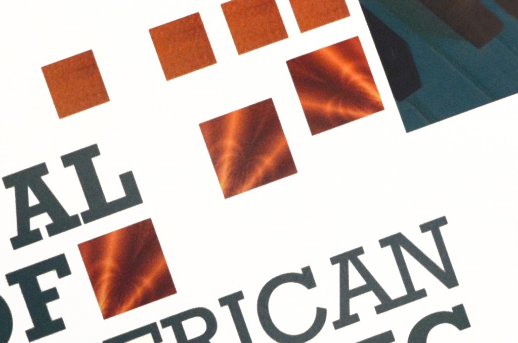
The purpose of this poster is to explore the use of typography as form so it is less concerned with...
This piece had to be a 16×20 inch, 2-sided poster to communicate all event information provided by the client, support...
This project was to develop an entire company idea starting with a product line that is based off of biomimicry...
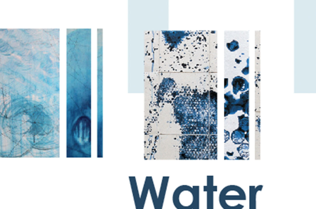
This system was to promote the art event that was part of a larger water campaign. The promotional system included...
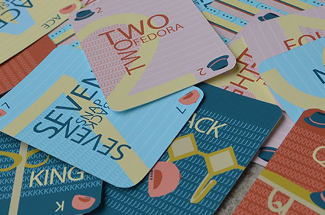
The background textures of these cards are pictures of paper that are taken so they do not look like paper,...
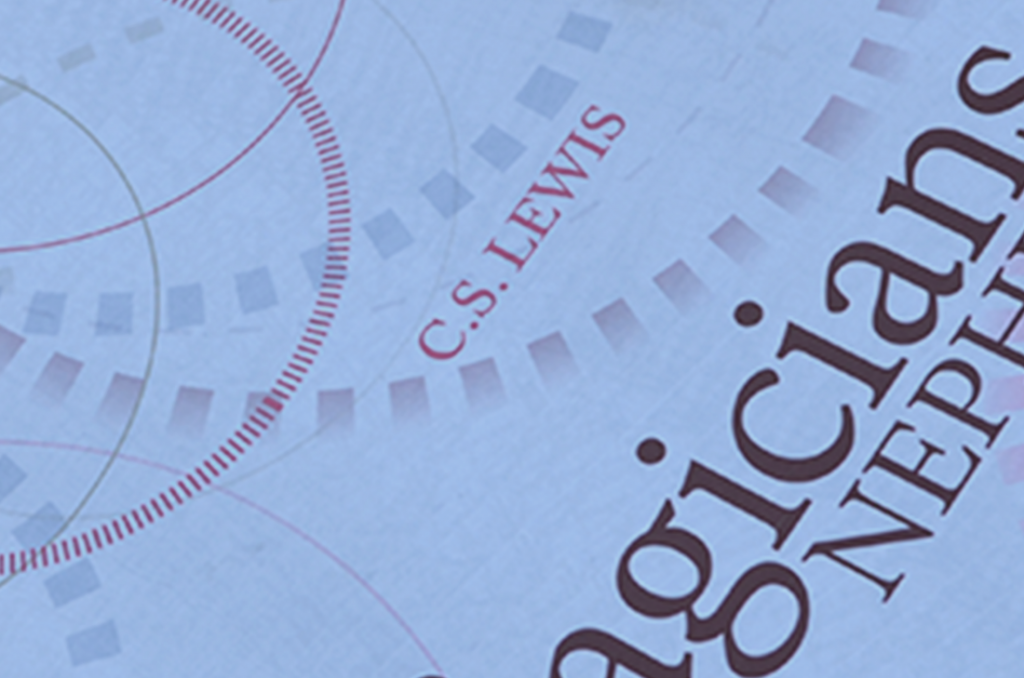
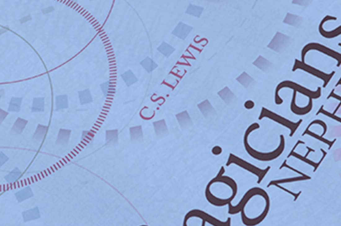
The direction of this book cover is to take a more mature look to appeal to a larger crowd than...
Playing cards have to be designed to fit a strict system in order to be functional. Each card design also...


