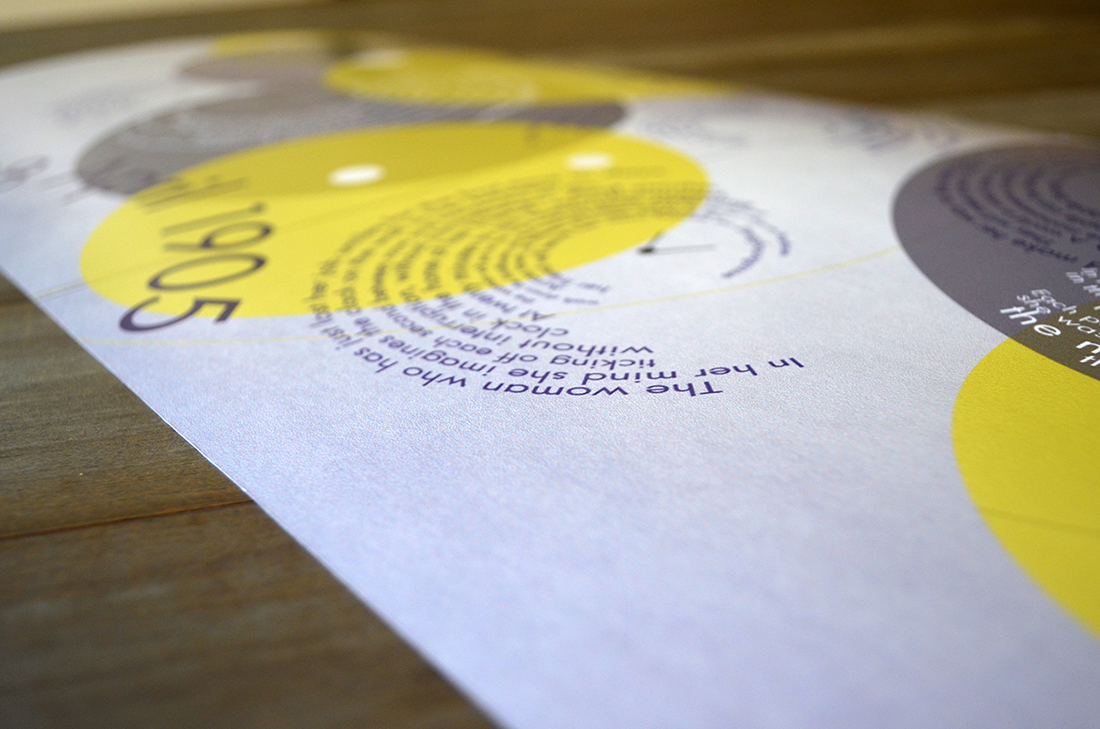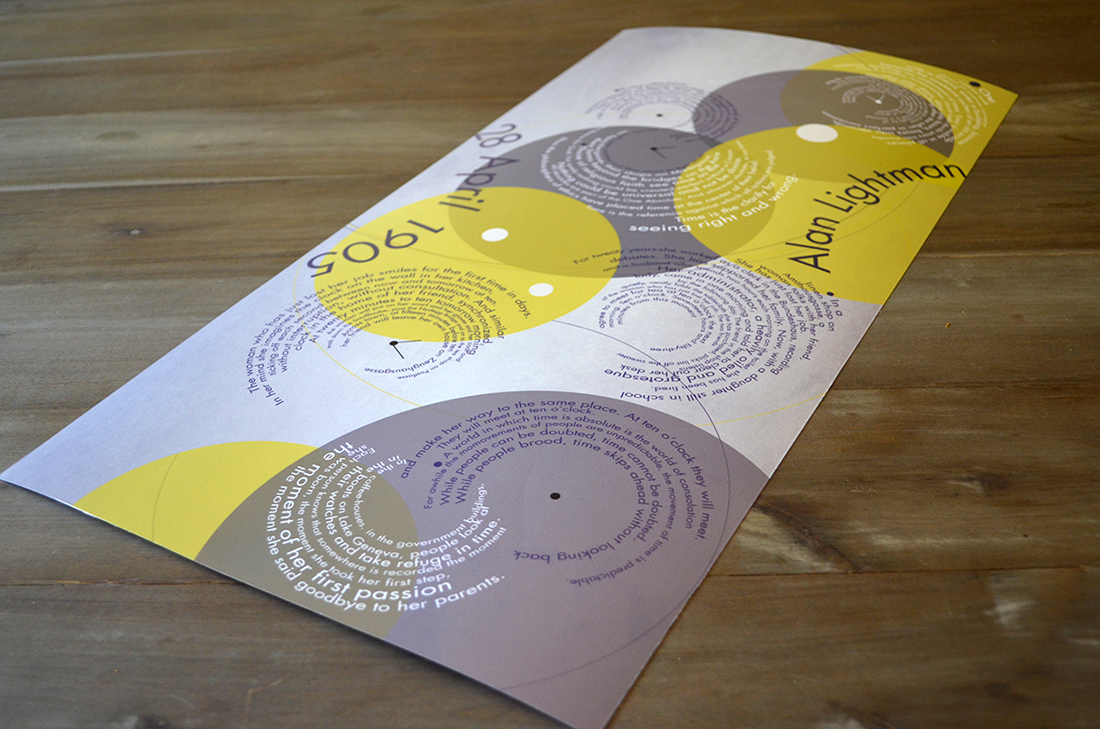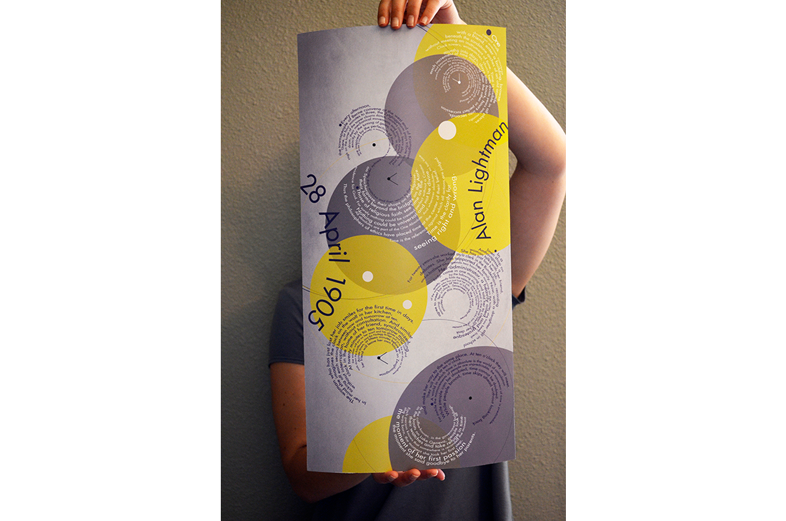
The purpose of this poster is to explore the use of typography as form so it is less concerned with legibility and readability. The design had to communicate what the journal entry discusses, which is the concept of time. So the background shapes and type took on the circular shape, like a clock. The way the circular type flows from top to bottom subtly hints at the inner mechanics of a clock. Circle is not only the shape of clock, but it also never-ending, just as time does not stop and does not end. The lines of type are various sizes to signify different lengths of time—seconds, minutes, hours, and days, weeks, years. The background texture is old vintage paper texture, which hints at time, as well, or how much time has passed.