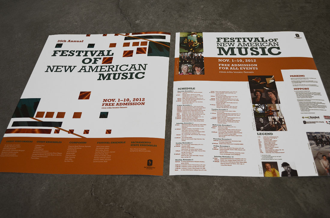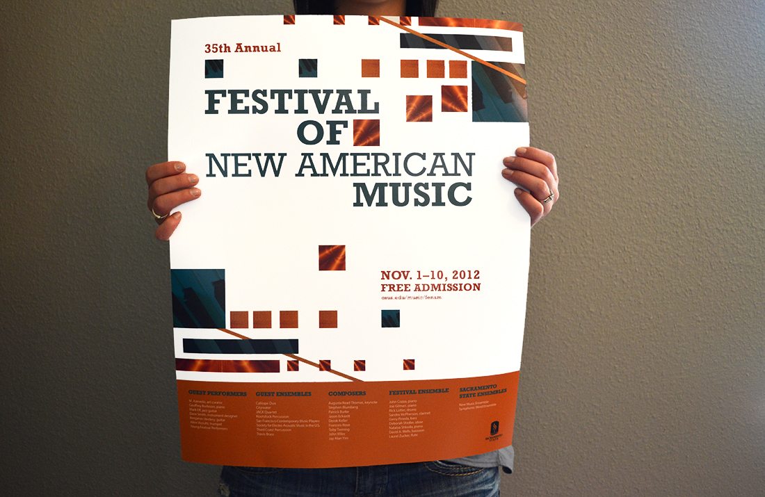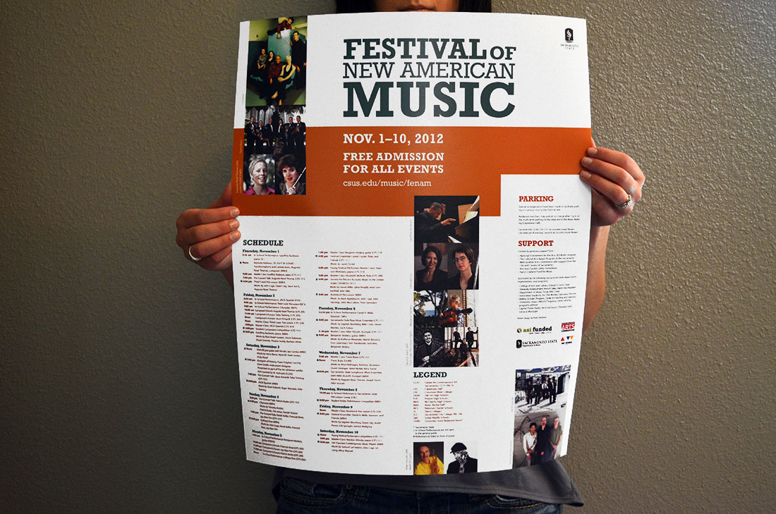
This piece had to be a 16×20 inch, 2-sided poster to communicate all event information provided by the client, support received, the message “new american music,” and use all images provided by the Client. The concept here is using basic shapes to illustrate music. The squares have harsher edges to communicate modern or “cutting edge.” Interval is a strong point of composition, which directly translates to music. The textures of images within the composition are piano, cymbol, and percussion. The typeface is a slab-serif to harmonize with the squares, still include the professionalism of serifs, and also be new and modern. The colors are meant to be punchy so the poster stands out as young, new music.