These logos were all designed for separate projects.
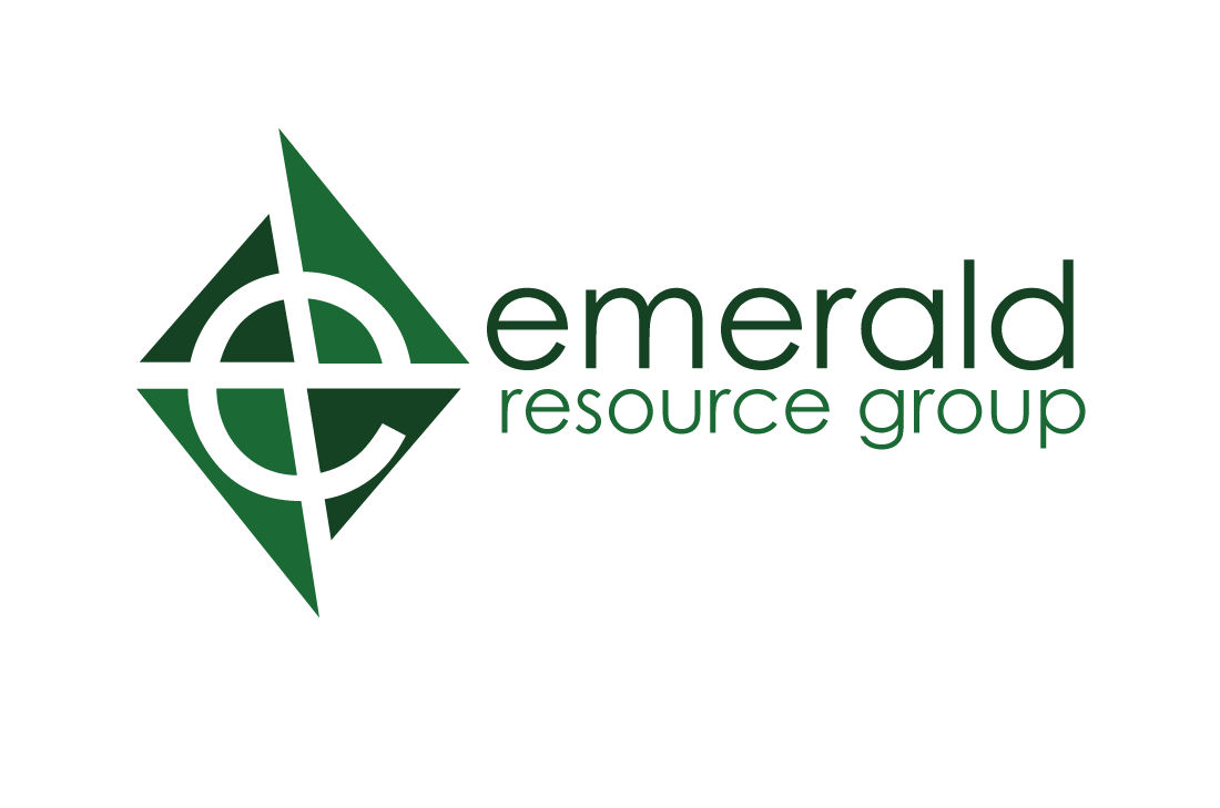
Emerald Resource Group was to use an “e” for Emerald and incorporate the triangular shape of the emerald. The solution was to use triangular emerald shapes coming together using the “e” from the typeface to form the white space between the emerald shapes.
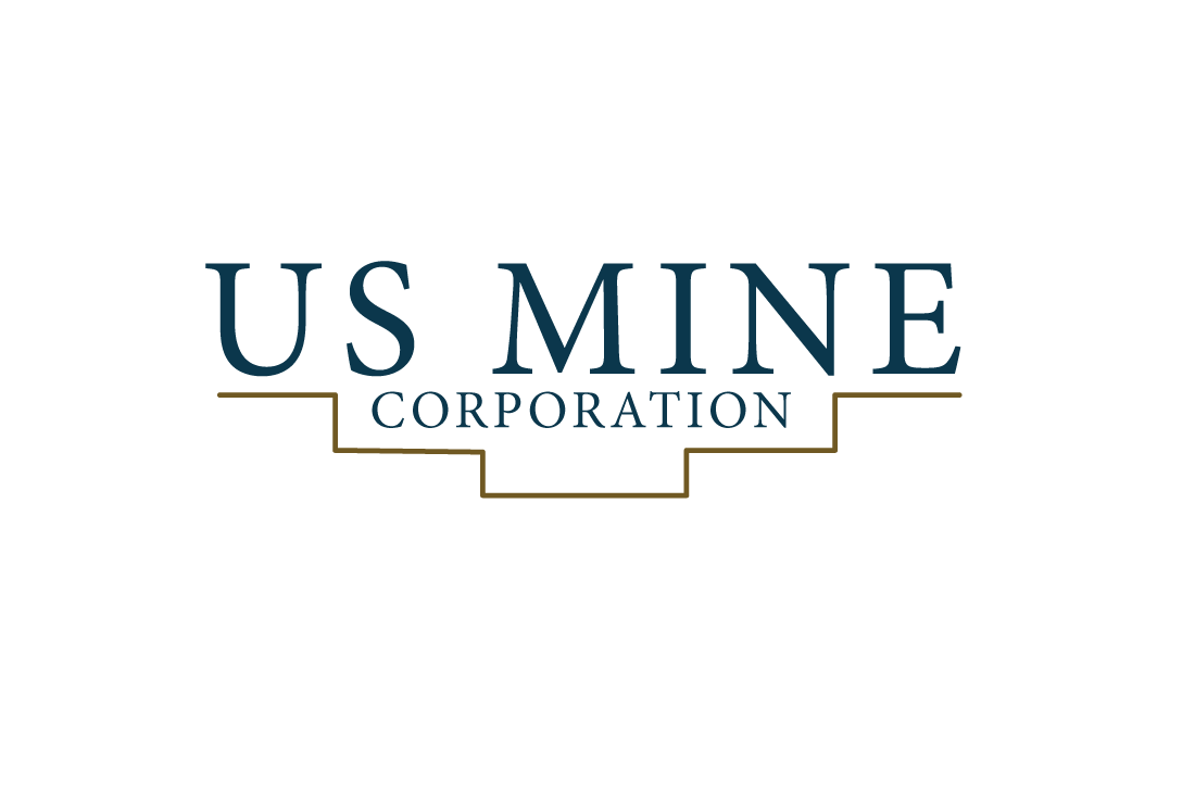
The US Mine logo was to incorporate the shape of the land at mining sites. After many concept sketches, the simplicity of having the stepped shape of the land go under the type was the strongest solution for the clients requests.
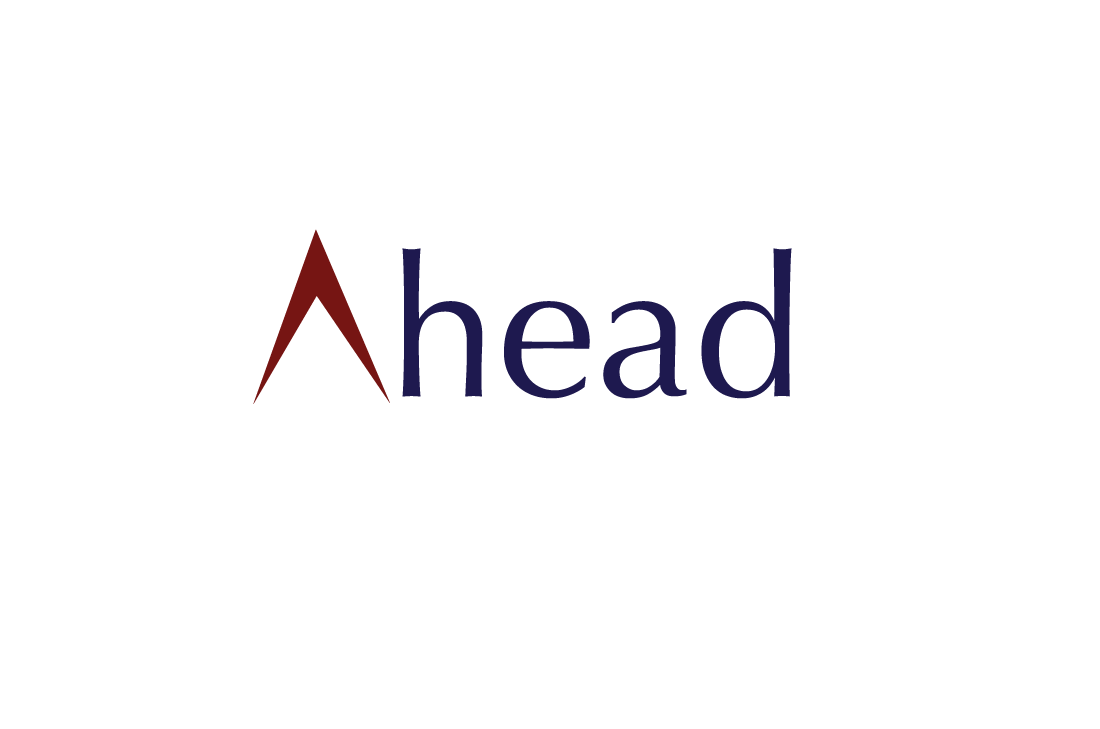
The Ahead logo is for a channel whose programming included shows that help high school students through the challenge of deciding on colleges and careers. The simple arrow as the “A” is to communicate the focus of the channel to help students straight ahead onto college and eventually their career.
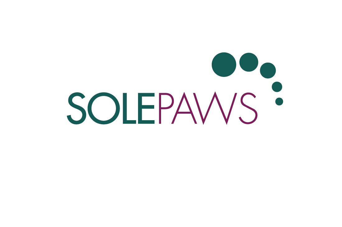
Solepaws, Inc. is a women’s shoe company that I developed whose shoes are inspired by the dog paw. So the circular shape of paw is placed in the form of human toes and placed over the type.
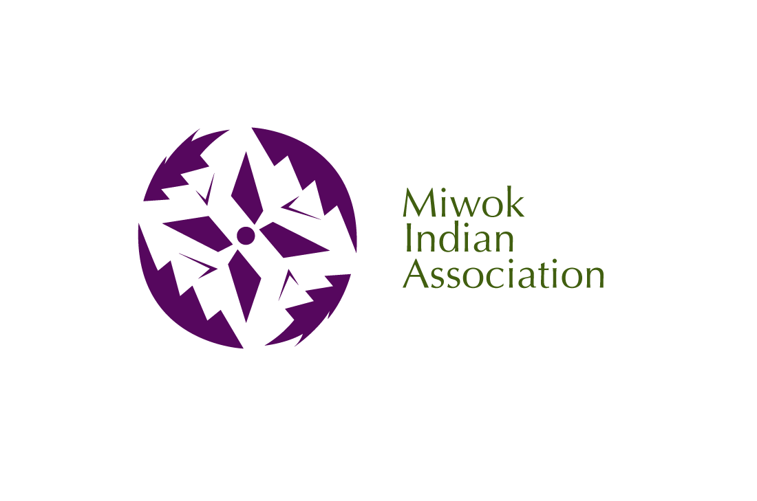
The Miwok logo communicates tree, spiritual direction, and the four directions as the Miwok Indians are very aware and respectful of nature, spiritual beings that find direction in their practice, and find meaning in the four directions.
You can read about the meaning of my own identity logo on my about page.