
The website needed to have a home page that talked about the house in general, a page that talked about the architect, a page about the style of the architecture, and a gallery. Each page had to be different enough so the next page was not predictable in any way, but it all needed to work together as a system as well. The style of the house is done in the international style, which is a radical simplification of form, uses glass, steel, and concrete as their preferred material, and loves transparency in buildings, meaning windows and a sense of weightlessness. The shape of the header image mimics the shape of one of the sides of the house. There is then an image shown within that shape. On the home page is a picture of the house, the architect page uses a picture of steel bars, the style page uses a picture of glass, and the gallery pages shows a building full of windows. Each page is a different color to keep the pages from being predictable, but each page also hints at what the color of the next page might be. The color of the title “Lovell” is the color that the bars and navigation appear to be on the next page with a tint of that color as the background of the next page.
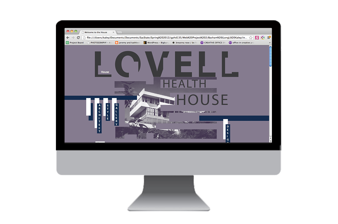
About the House
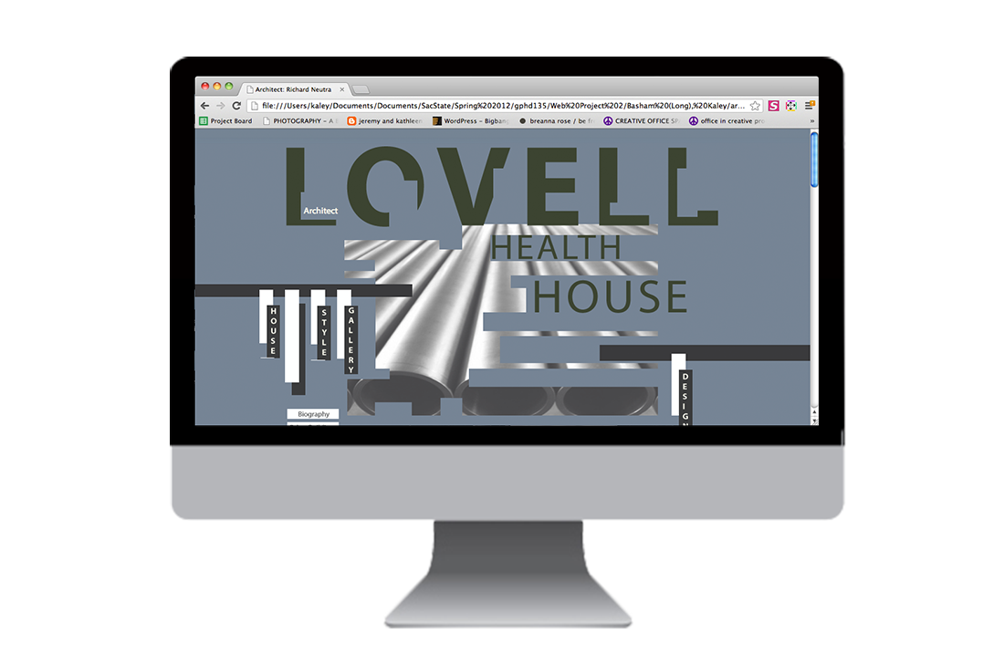
About the Architect
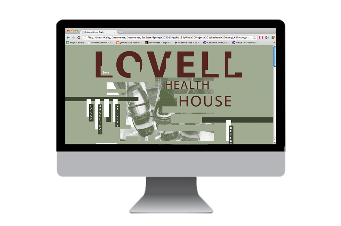
About the Style
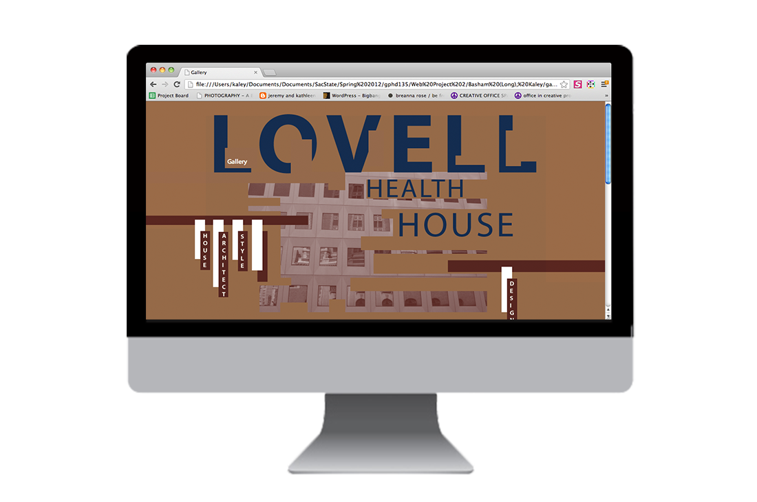
Gallery