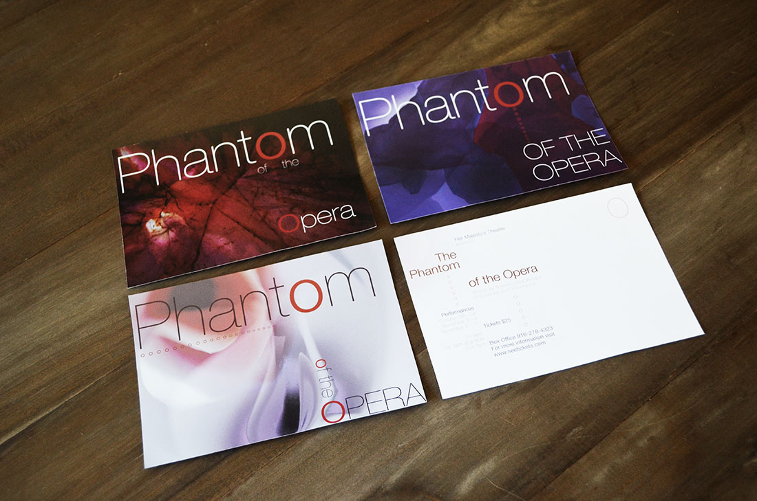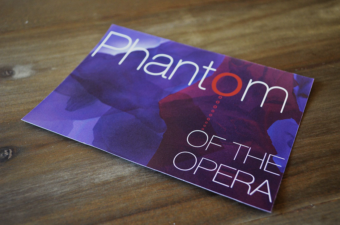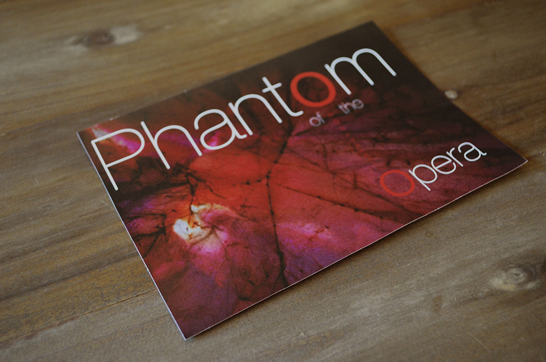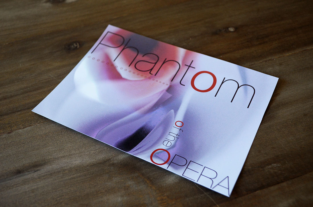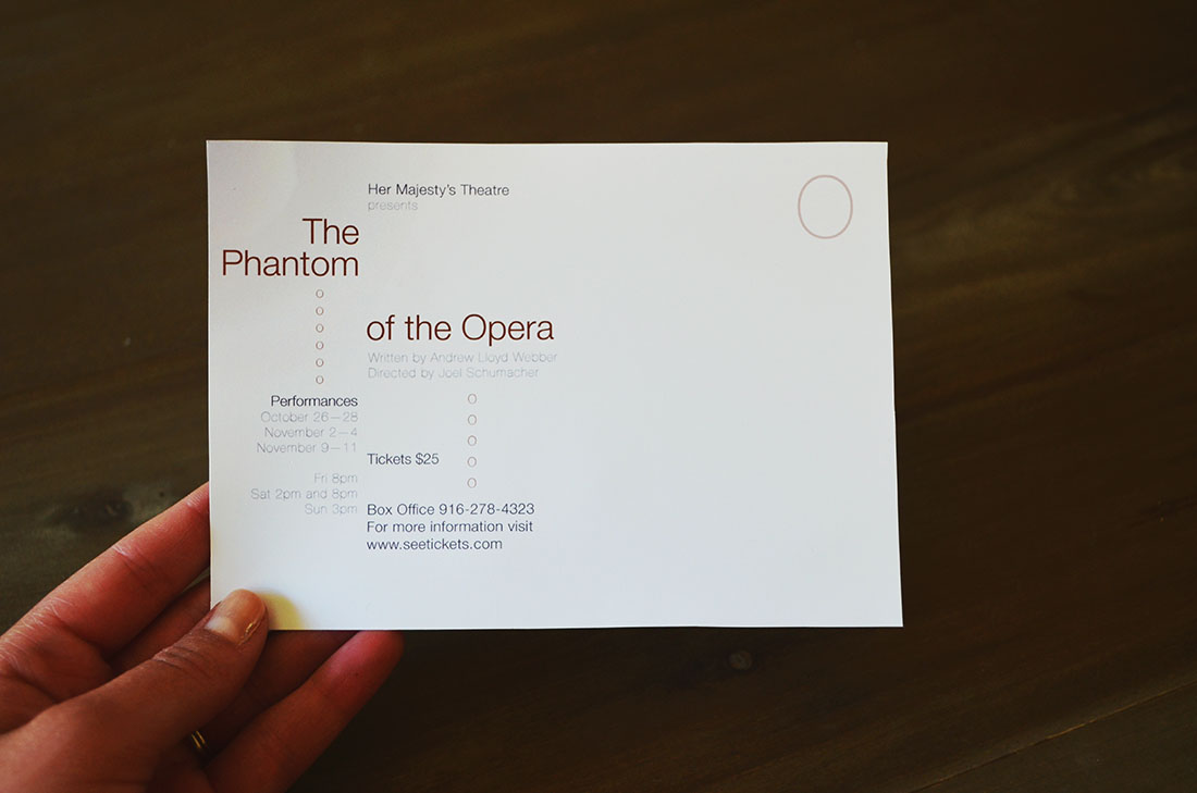
The background textures of these cards are pictures of paper that are taken so they do not look like paper, and then further manipulated with color in photoshop, to reach a texture that communicates something about the musical that the postcards are promoting. These are promoting The Phantom of the Opera musical and the texture for each postcard represents a different character. The postcards design use the “O’s” in the title as art elements with meaning. The first postcard is purple and has one “O” that is red. This card represents Raoul as the texture is heroic and brave. The single red “O” means that it is the first postcard sent out and the first character introduced. The next card is the dark red card with two red “O’s” as it is the second postcard mailed out and the second character introduced. This card represents the Phantom as the texture has deep reds and blacks and includes a spider web-like texture. The last card is the light postcard that uses a rose-like texture with soft edges and curves to represent Christine. The dark areas of the card symbolize her inner struggles she faces in the musical. All 3 “O’s” are red as it is the third and final card to be sent out and she is the third character to be introduced. All postcards have the same back and use the “O” element to connect the type and also mark where the stamp goes.