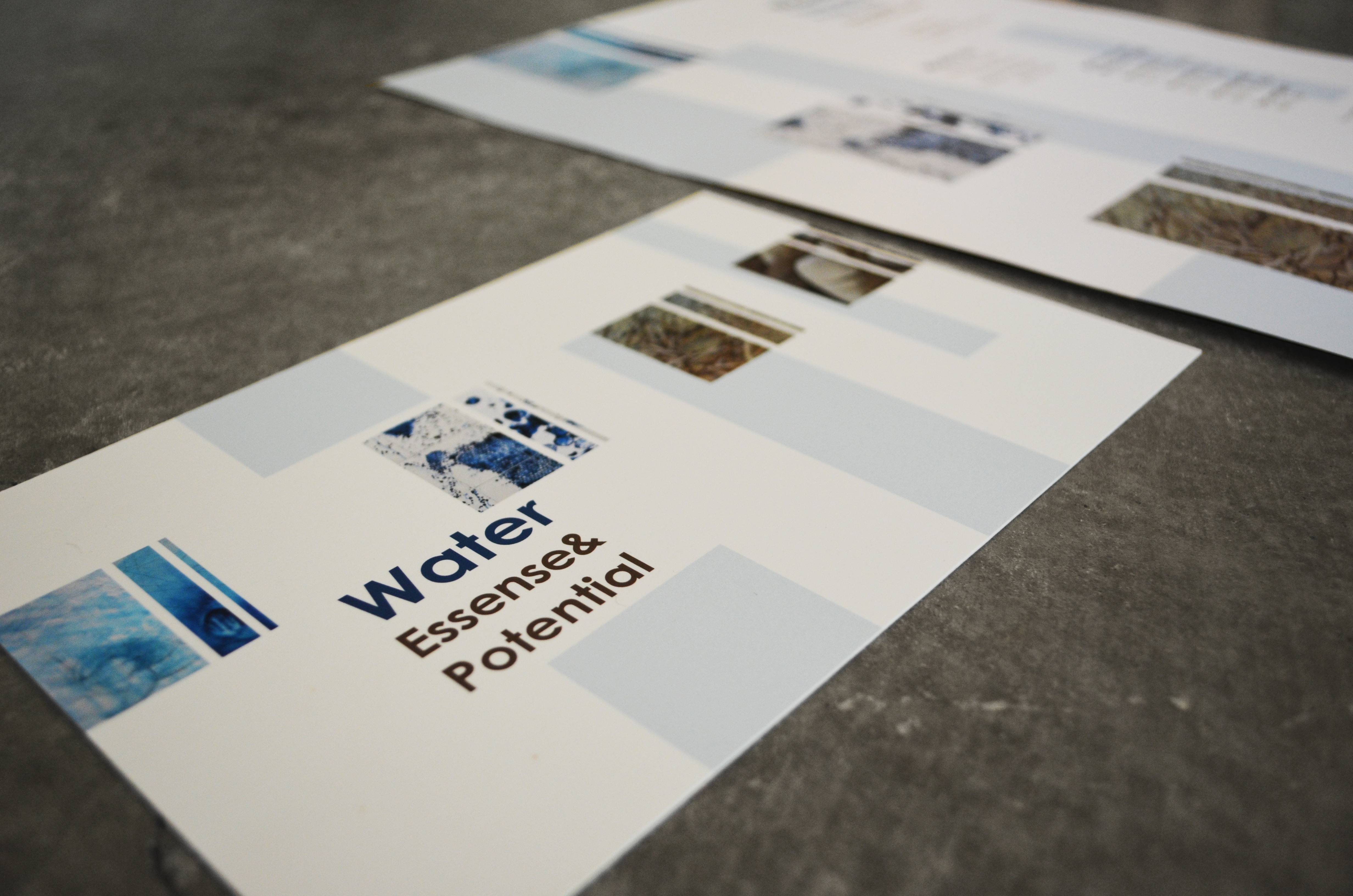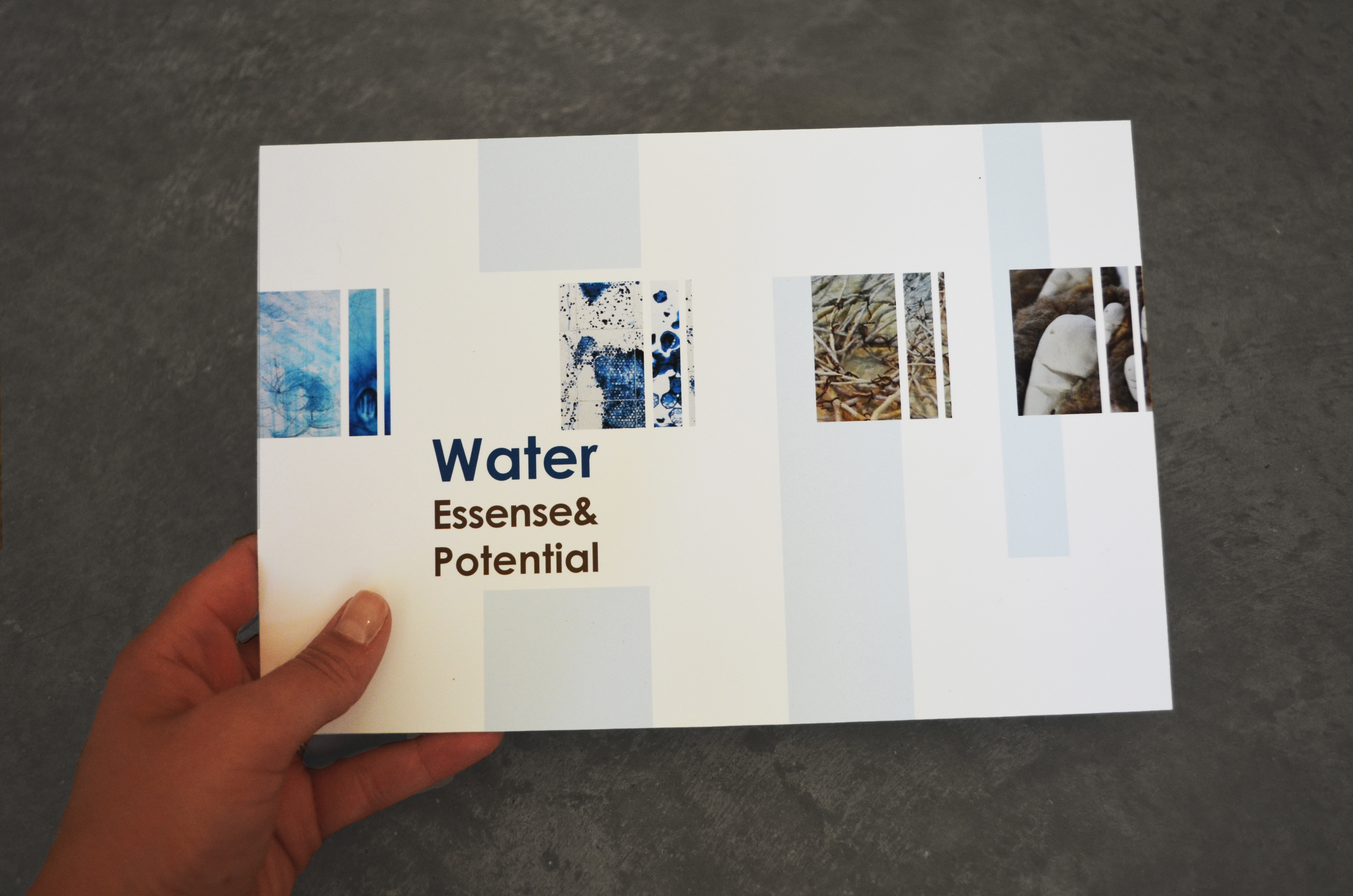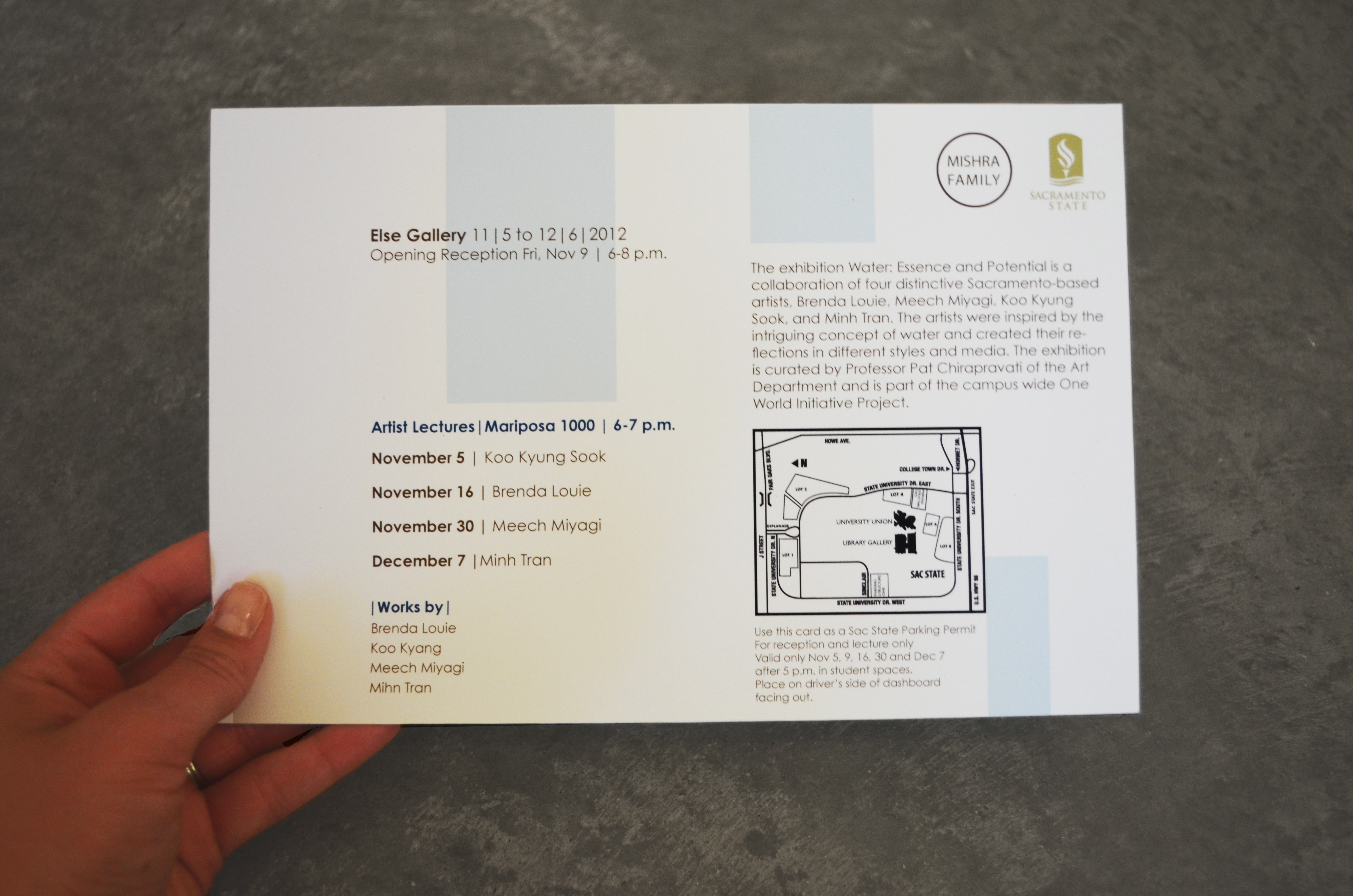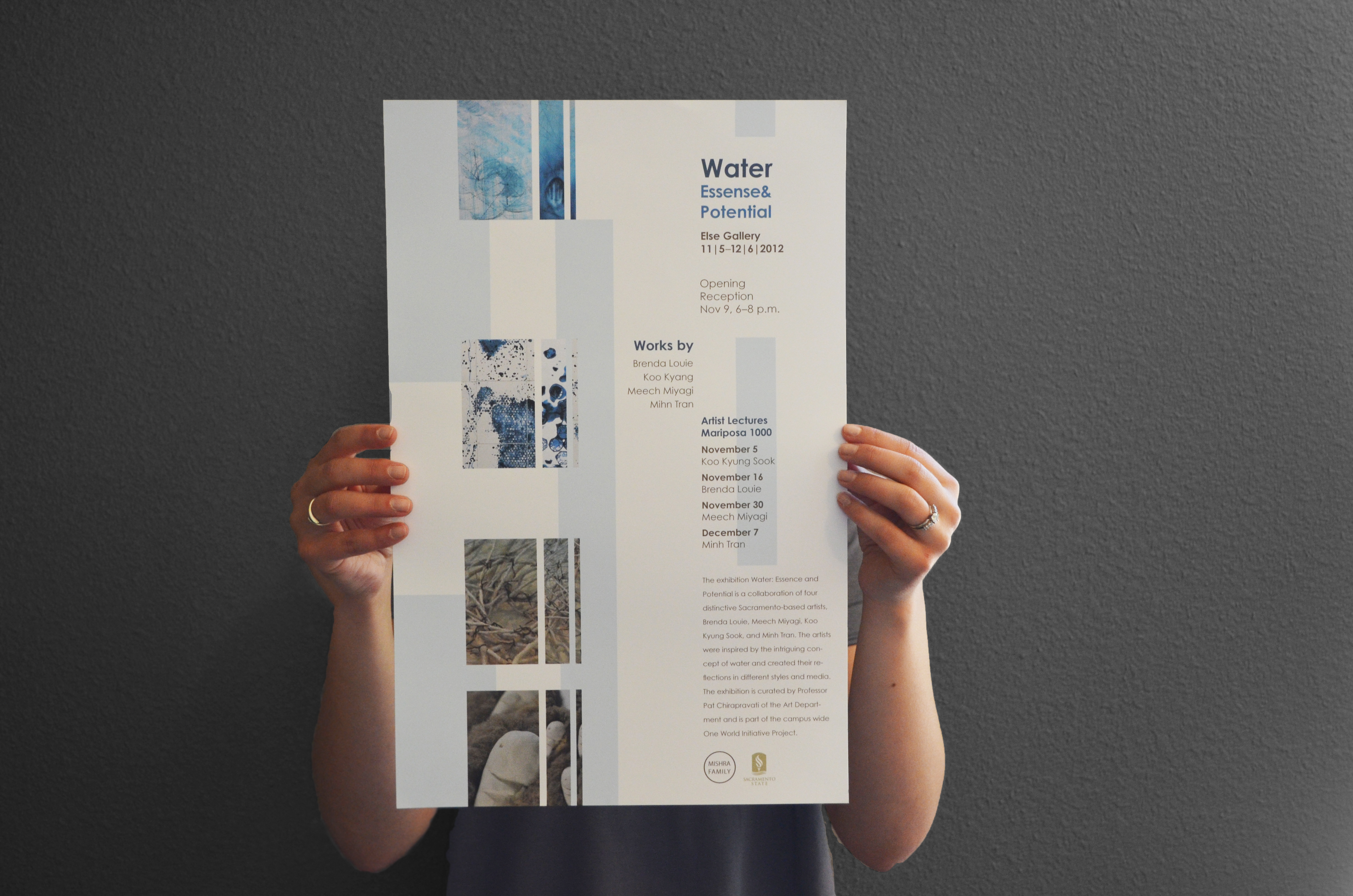
This system was to promote the art event that was part of a larger water campaign. The promotional system included the poster and the postcard mailers. The pieces needed to work as a system despite the very different dimensions of each piece. There were 4 artists that did compositions of water that were to be equally displayed in the design of the promotional materials. The color palette was established from the photos of the artist’s compositions we were to incorporate. I chose to display the artwork and information in intervals. Just as intervals come in different thicknesses and time, so water comes at different strengths and times. For example, thick intervals could represent the stronger potential of water, such as a hurricane or tsunami, that strike when they want to. The thinner intervals represents the simple, delicate essence of water, as the necessity to life, that we seek out on a daily basis.